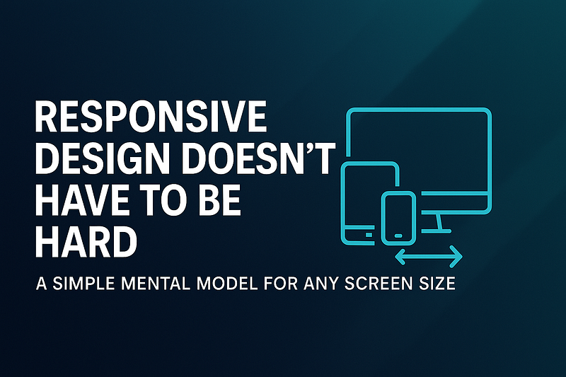
Stop overthinking media queries — here’s a straightforward way to design layouts that work everywhere.
Introduction
Responsive design has been around for more than a decade, yet it continues to frustrate developers. How do you make a layout look good on a 5-inch phone, a 15-inch laptop, and a 27-inch monitor — without writing endless CSS overrides?
The problem is that most developers think of responsive design as a list of hacks — media query here, breakpoint there — until the stylesheet turns into spaghetti.
But what if you had a mental model that simplified everything? One way of thinking that you could apply to any project, no matter the framework or tools?
In this article, I’ll walk you through a simple mental model for responsive design, with examples you can copy-paste into your next project.
1. Think in Boxes, Not Pixels
The foundation of responsive design is the box model. Everything — containers, cards, buttons — is a box that can stretch or shrink.
Instead of thinking in fixed pixel widths (width: 1200px), think in fluid units (%, em, rem, minmax).
/* Bad: fixed width */
.container {
  width: 1200px;
}

/* Good: fluid width */
.container {
  width: 100%;
  max-width: 1200px;
  margin: auto;
}
👉 Mental model: Boxes are flexible. Let them breathe.
2. Mobile-First Is Simpler Than Desktop-First
One of the biggest mistakes is starting with a large desktop layout and then trying to “shrink it” down. That’s hard.
Instead, design for the smallest screen first, then progressively enhance as screens get bigger.
/* Default = mobile */
.card {
  display: block;
}

/* Add layout as space allows */
@media (min-width: 768px) {
  .card {
    display: flex;
  }
}
👉 Mental model: Start small → add complexity only when you have more space.
3. Use a Few Logical Breakpoints (Not Dozens)
Developers often create too many breakpoints: 480px, 600px, 720px, 960px, 1024px, 1280px…
Reality check: you don’t need that many. Most designs adapt fine with 3–4 breakpoints:
- Small (mobile):
< 640px - Medium (tablet):
641–1024px - Large (desktop):
1025–1440px - XL (big screens):
>1440px
@media (min-width: 640px) { /* tablet */ }
@media (min-width: 1024px) { /* desktop */ }
@media (min-width: 1440px) { /* large desktop */ }
👉 Mental model: Breakpoints = “content needs more space” → not device width.
4. Let Flexbox and Grid Do the Heavy Lifting
Forget float hacks. Modern CSS was built for responsive layouts.
Flexbox Example
.navbar {
  display: flex;
  flex-direction: column; /* default: mobile */
}

@media (min-width: 768px) {
  .navbar {
    flex-direction: row; /* larger screens */
  }
}
Grid Example
.grid {
  display: grid;
  grid-template-columns: 1fr; /* one column by default */
}

@media (min-width: 768px) {
  .grid {
    grid-template-columns: repeat(3, 1fr); /* three columns */
  }
}
👉 Mental model: Use Flexbox for alignment, Grid for structure.
5. Typography Should Scale Fluidly
A common mistake: font sizes look great on desktop but overwhelming on mobile.
Instead of hardcoding, use fluid typography with clamp().
h1 {
  font-size: clamp(1.5rem, 5vw, 3rem);
}
This means:
- Minimum size =
1.5rem - Grows with viewport width (
5vw) - Maximum size =
3rem
👉 Mental model: Text should “breathe” with the screen.
6. Images and Media Should Be Flexible Too
Nothing breaks a layout faster than an oversized image.
img {
  max-width: 100%;
  height: auto;
}
For responsive background images:
.hero {
  background-image: url("hero.jpg");
  background-size: cover;
  background-position: center;
}
👉 Mental model: Media should adapt, not dictate layout.
7. Embrace Container Queries (2025 and Beyond)
Media queries target the viewport. But in real projects, you often want a component to adapt to its container.
.card {
  container-type: inline-size;
}

@container (min-width: 400px) {
  .card__title {
    font-size: 1.5rem;
  }
}
This is the future: components that are self-responsive no matter where they’re placed.
👉 Mental model: Components know their own space.
Real-World Example: Responsive Card Layout
<div class="grid">
  <div class="card">Card 1</div>
  <div class="card">Card 2</div>
  <div class="card">Card 3</div>
</div>
.grid {
display: grid;
grid-template-columns: 1fr; /* mobile */
gap: 1rem;
}
@media (min-width: 768px) {
.grid {
grid-template-columns: repeat(3, 1fr); /* desktop */
}
}
.card {
padding: 1rem;
background: #fff;
border-radius: 0.5rem;
box-shadow: 0 2px 6px rgba(0,0,0,0.1);
}👉 This works on mobile, tablet, and desktop — without a dozen breakpoints.
Conclusion
Responsive design doesn’t have to be hard. If you follow this mental model:
- Think in boxes, not pixels
- Start mobile-first
- Use a few logical breakpoints
- Leverage Flexbox and Grid
- Make typography fluid
- Keep images flexible
- Adopt container queries
…then you can build UIs that adapt gracefully to any screen size without drowning in CSS overrides.
Responsive design becomes a mindset, not a chore.
Call to Action (CTA)
👉 What’s the hardest part of responsive design for you — layouts, typography, or images?
Share in the comments, and let’s help each other build better UIs.


Leave a Reply