Stop wasting hours chasing misaligned elements, learn the mistakes that sabotage your UI, and how to prevent them.

Hook & Context
Frontend layout errors can turn a polished website into a chaotic mess in minutes. Have you ever spent hours adjusting padding, margins, or grid layouts, only to realize your entire layout is broken because of one tiny mistake?
Getting layouts right is more than aesthetics; it affects user experience, performance, and maintainability. One misplaced CSS rule or overlooked HTML structure, can turn your polished interface into a chaotic mess. In this article, we’ll walk through 7 common frontend layout errors, why they happen, and exactly how to prevent them.
By the end, you’ll have a mental checklist to keep your layouts consistent and resilient.
1. Ignoring Box-Sizing
The Mistake: Relying on the default content-box model.

By default, CSS calculates an element’s width and height excluding padding and borders. This often causes elements to overflow their containers.
Example:
div {
  width: 300px;
  padding: 20px;
  border: 5px solid black;
}
Even though we set width: 300px, the actual rendered width is 345px, breaking the layout.
Fix: Use box-sizing: border-box. It includes padding and borders in the element’s width and height:
* {
  box-sizing: border-box;
}
Why it works: This makes width calculations predictable and prevents accidental overflows.
Pro Tip: Apply it globally at the top of your CSS for consistent behavior across all elements.
2. Overusing Absolute Positioning
The Mistake: Using position: absolute for layout instead of alignment.

Absolute positioning removes elements from the normal flow, which can disrupt responsive designs.
Example:
header {
  position: absolute;
  top: 0;
  left: 0;
}
It may look fine on a desktop, but mobile screens will likely clip or overlap your header.
Fix: Use Flexbox or CSS Grid for layout alignment:
header {
  display: flex;
  justify-content: space-between;
  align-items: center;
}
Why it works: Flexbox/Grid keeps elements in flow and ensures responsive behavior.
Pro Tip: Reserve absolute only for minor overlays, tooltips, or floating buttons.
3. Forgetting Responsive Units
The Mistake: Using only pixels (px) for width, padding, and font sizes.

Hard-coded units don’t adapt to different screen sizes, creating broken layouts on smaller devices.
Example:
.container {
  width: 500px;
  padding: 20px;
}
This works on desktop but overflows on mobile.
Fix: Use relative units like %, em, rem, or vw:
.container {
  width: 90%;
  padding: 1rem;
}
Why it works: Layouts scale dynamically across screens, improving responsiveness.
Pro Tip: Combine % for width and rem for padding/margin for consistent spacing.
4. Not Using a CSS Reset or Normalize
The Mistake: Assuming browsers render the same default styles.

Browsers apply their own styles, which can vary. Ignoring this leads to inconsistent spacing, font sizes, and margins.
Fix: Use a CSS reset or normalize library:
/* Example: Normalize.css */
@import-normalize;
Why it works: This establishes a consistent baseline across all browsers.
Pro Tip: Include it at the very top of your CSS or main SCSS file to avoid conflicts.
5. Mixing Units Inconsistently
The Mistake: Using px for some margins, em for others, % for width, all in the same component.

Inconsistent units break layout scaling and make maintenance a nightmare.
Example:
button {
  padding: 10px 1em;
  margin: 5%;
}
The button looks fine on desktop but disproportionate on smaller screens.
Fix: Standardize on relative units (rem for spacing, % for widths) whenever possible.
Why it works: Consistency ensures layouts scale predictably and avoids unexpected overflow or overlap.
Pro Tip: Consider defining a spacing scale (e.g., 0.5rem, 1rem, 2rem) and reuse it throughout your project.
6. Ignoring Overflow Issues
The Mistake: Forgetting to handle overflowing content in containers.
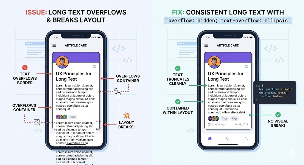
Text, images, or dynamically loaded content can spill outside their container, breaking your layout.
Example:
.card {
  width: 200px;
  height: 100px;
}
.card p {
  /* long text */
}
Fix: Control overflow explicitly:
.card {
  overflow: hidden; /* or scroll, auto */
  text-overflow: ellipsis; /* for long text */
}
Why it works: Prevents content from spilling, keeps UI clean, and improves UX.
Pro Tip: For responsive images, add max-width: 100%; height: auto; to avoid stretching containers.
7. Not Leveraging Modern Layouts (Flex/Grid)
The Mistake: Sticking to float-based layouts or outdated hacks.
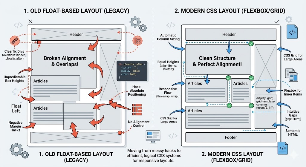
Floats are brittle and often require clearfixes. Tables for layout? Even worse.
Fix: Use Flexbox for one-dimensional layouts and CSS Grid for two-dimensional layouts:
/* Flex example */
.navbar {
  display: flex;
  justify-content: space-between;
  align-items: center;
}

/* Grid example */
.gallery {
  display: grid;
  grid-template-columns: repeat(auto-fill, minmax(200px, 1fr));
  gap: 1rem;
}
Why it works: Modern layout systems are responsive, robust, and easier to maintain.
Pro Tip: Start new projects with Flex/Grid instead of relying on old float hacks.
Conclusion
Layouts don’t have to be a source of frustration. By avoiding these 7 common mistakes, you’ll create cleaner, more maintainable, and responsive frontends.
Key Takeaways:
- Always use
box-sizing: border-box. - Favor Flex/Grid over absolute positioning.
- Embrace relative units for responsive design.
- Normalize CSS for consistent browser behavior.
- Standardize units for easier maintenance.
- Handle overflow properly.
- Leverage modern layout tools to simplify complex structures.
💡 Your next step: Pick one of these tips and implement it in your project today. You’ll notice your layout issues shrink dramatically, and your sanity will thank you.
If you found this article helpful, follow, comment, and share to help fellow developers save hours of debugging.


Leave a Reply