Flexbox is powerful, but subtle mistakes can lead to unexpected layouts and wasted hours. Learn the five most common misuses and how to fix them for clean, responsive designs.
Introduction
Flexbox is one of the most widely used CSS layout tools today. It promises flexible, responsive layouts with minimal code, yet many developers struggle with it.
Why? Because Flexbox is deceptively simple. Small misunderstandings about alignment, sizing, or direction can lead to broken layouts, overlapping elements, or inconsistent spacing.
In this article, we’ll cover five ways you’re probably misusing Flexbox along with actionable fixes that will make your layouts predictable and maintainable.
1. Relying on justify-content: center for Vertical Alignment
The Problem
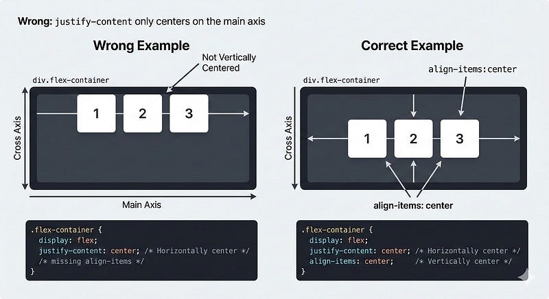
Many developers assume justify-content centers items both horizontally and vertically. In Flexbox:
justify-content→ Main axisalign-items→ Cross axis
If your flex container is row-based (default), justify-content: center centers items horizontally, not vertically.
/* ❌ Misused */
.container {
  display: flex;
  justify-content: center;
}
.item {
  height: 100px;
}
The Fix
Use align-items for vertical centering:
/* ✅ Correct */
.container {
  display: flex;
  justify-content: center; /* horizontal */
  align-items: center;    /* vertical */
  height: 200px;
}
Tip: If you need full centering in both directions, use both properties.
2. Misunderstanding flex: 1 vs flex-grow
The Problem
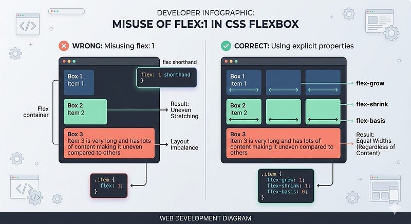
Many assume flex: 1 makes all items equal in size regardless of content.
/* ❌ Misused */
.item {
  flex: 1;
}
Issues arise if one item has more content; it can stretch unevenly or break the layout.
The Fix
Use explicit flex-grow, flex-shrink, and flex-basis:
/* ✅ Correct */
.item {
  flex-grow: 1;
  flex-shrink: 1;
  flex-basis: 0; /* ensures equal width ignoring content */
}
Rule: flex: 1 is shorthand for 1 1 0%. Know what each part does.
3. Forgetting the min-width / min-height Defaults

The Problem
Flex items have default minimum sizes. When shrinking containers, items may not shrink as expected, causing overflow.
/* ❌ Misused */
.item {
  flex: 1;
}
Large content prevents shrinking because of the default min-width: auto.
The Fix
Set min-width or min-height to 0 when necessary:
/* ✅ Correct */
.item {
  flex: 1;
  min-width: 0; /* allows proper shrinking */
}
Tip: This is especially important in horizontal scrolling layouts or nested flex containers.
4. Overusing margin: auto Instead of Alignment Properties

The Problem
Some developers use margin-left: auto; margin-right: auto for centering in Flexbox. It works, but it’s less readable and can cause unexpected spacing in nested flex layouts.
/* ❌ Misused */
.item {
  margin-left: auto;
  margin-right: auto;
}
The Fix
Use Flexbox alignment properties:
/* ✅ Correct */
.container {
  display: flex;
  justify-content: center; /* horizontal centering */
  align-items: center;    /* vertical centering */
}
Tip: Reserve margin: auto for special cases, like pushing an item to one side.
5. Ignoring Flex Direction When Nesting Containers
The Problem
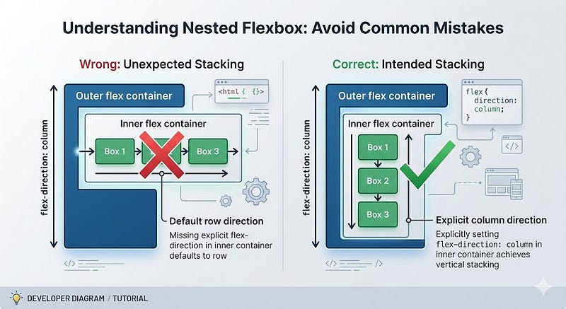
Nested flex containers default to flex-direction: row. Developers often forget this, causing unexpected layouts.
/* ❌ Misused */
.outer {
  display: flex;
  flex-direction: column;
}
.inner {
  display: flex; /* defaults to row */
}
If you expected a column inside, you get horizontal stacking instead.
The Fix
Always specify direction explicitly in nested containers:
/* ✅ Correct */
.inner {
  display: flex;
  flex-direction: column;
}
Tip: Use flex-direction thoughtfully for predictable layouts, especially in responsive designs.
Key Takeaways
- Use
align-itemsfor vertical alignment, not justjustify-content. - Understand flex shorthand (
flex: 1) know grow, shrink, basis. - Set
min-width/min-heightto 0 when needed to prevent overflow. - Use alignment properties instead of overusing
margin: auto. - Always specify
flex-directionin nested containers.
By avoiding these mistakes, your Flexbox layouts become predictable, responsive, and maintainable.
Next Steps
- Audit your current layouts and identify any misused Flexbox patterns.
- Experiment with nested containers using explicit
flex-direction. - Pair Flexbox with CSS Grid when more complex 2D layouts are required.
- Test layouts in different viewport sizes to ensure responsiveness.
Strong Call to Action:
Open your latest project and check your Flexbox usage. Fix one misalignment or overflow issue today, and small tweaks compound into cleaner, more reliable layouts that save hours of frustration.


Leave a Reply